Current OS is a compact, modern design system I built to demonstrate my end-to-end ability to define visual foundations, system tokens, and reusable components. The goal was to create a calm, structured interface language that feels soft, functional, and human-centered while showcasing my technical Figma proficiency and design systems thinking.
This project was created as complete example of my visual systems capability. I focused on clarity, scalability, and craft: establishing consistent typography, color tokens, spacing logic, grid structure, and core components that can scale into real product UI.
Key considerations included:
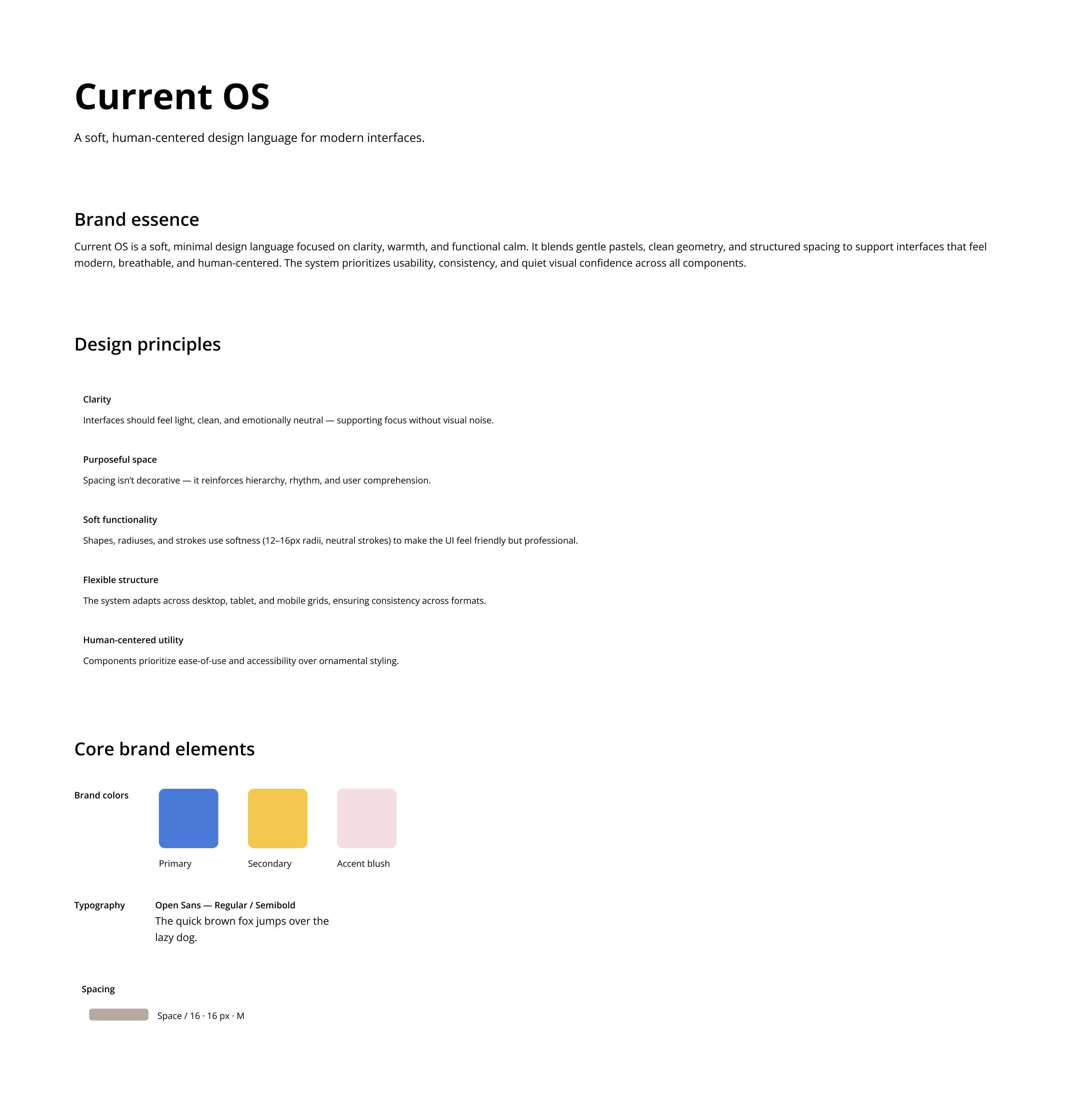
I defined Current OS as a system grounded in calm clarity. Its aesthetic is defined by breathable layouts, soft neutral palette, and functional warmth. Key pillars of the visual identity included:
The result is a visual language that feels gentle, easy, clear and product-forward.
Design a system that:
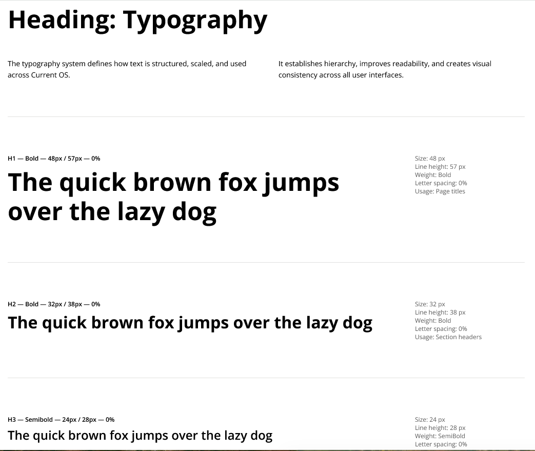
I defined a full type scale with clear hierarchy, consistent line heights, and tokenized text styles for universal application across UI components and reading environments.
The system includes:
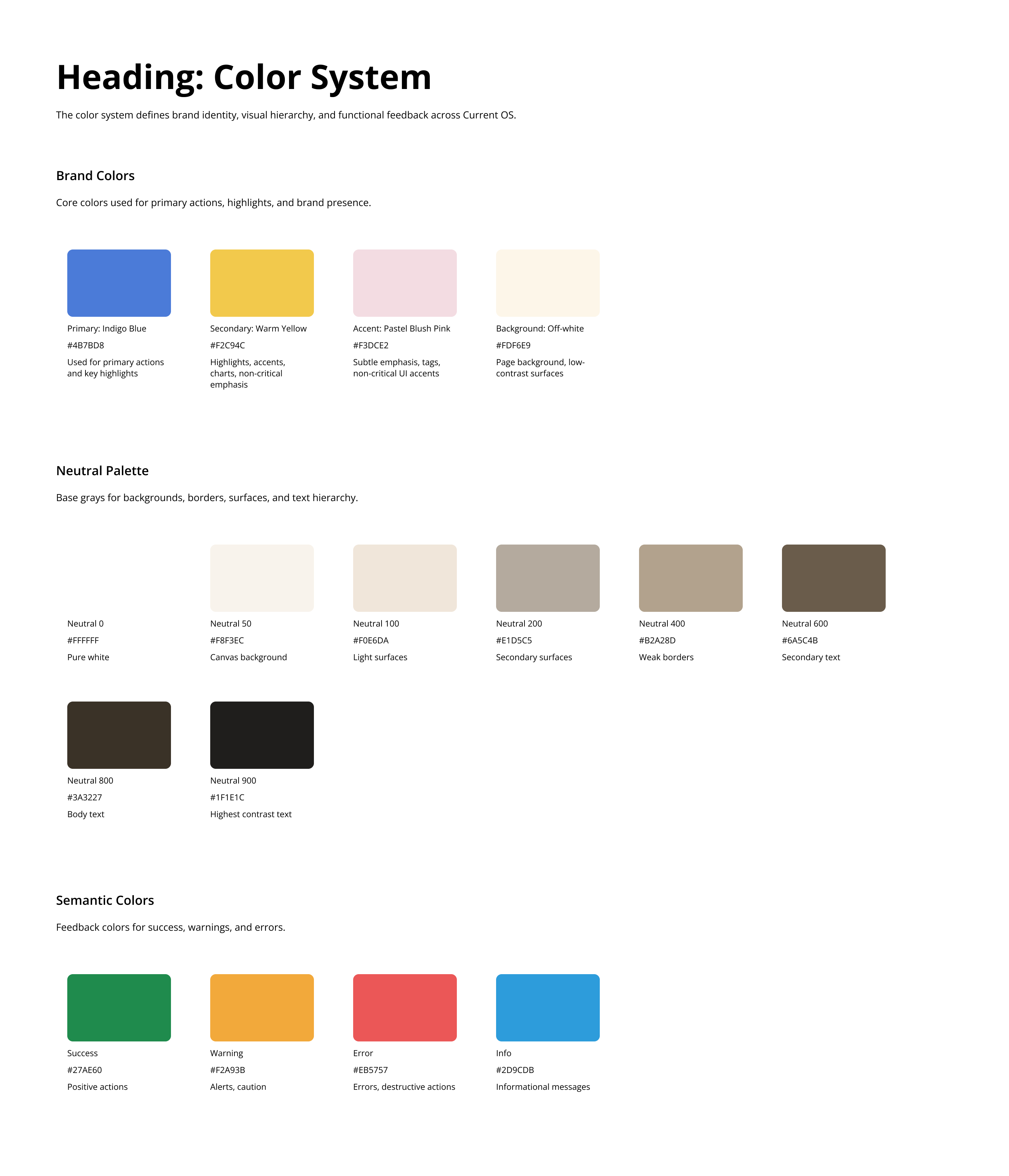
The color palette includes three layers:
1. Neutral scale (50–900)
Soft grays with smooth contrast steps for text, dividers, surfaces, and containers.
2. Accent color (Blush 50–700)
A warm pastel pink used sparingly for emphasis and interactive elements.
3. Functional colors (optional extension)
Space reserved for future states (success, error, warning), following the same tonal logic.
Each color token supports:
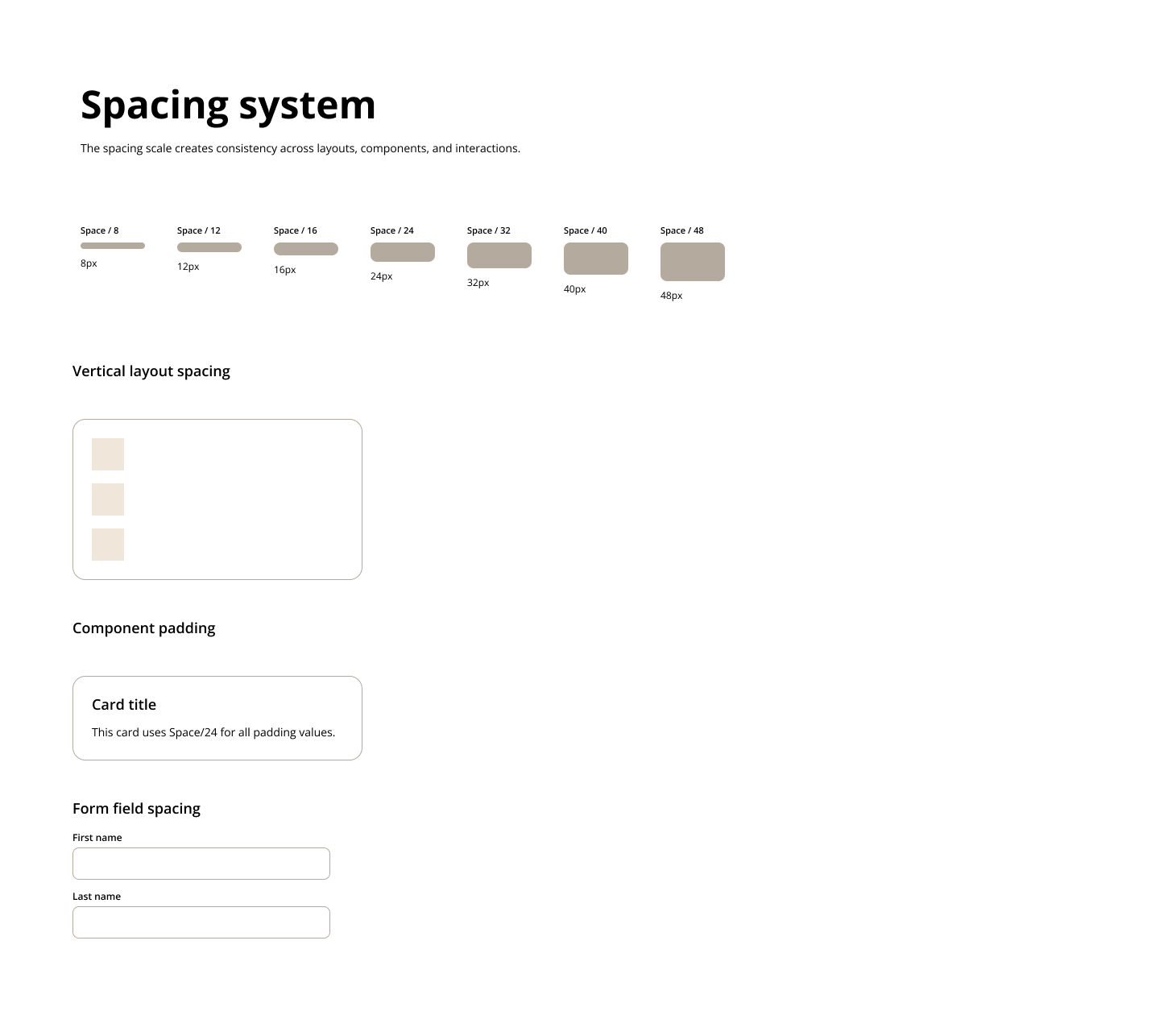
I established a spacing scale based on 4px increments to create predictable, rhythmic layout structures.
Spacing scale (excerpt):
4 / 8 / 12 / 16 / 20 / 24 / 32 / 40 / 48 / 64
The grid system adapts across breakpoints:
This ensures consistent layout behavior while giving designers flexible composition options.
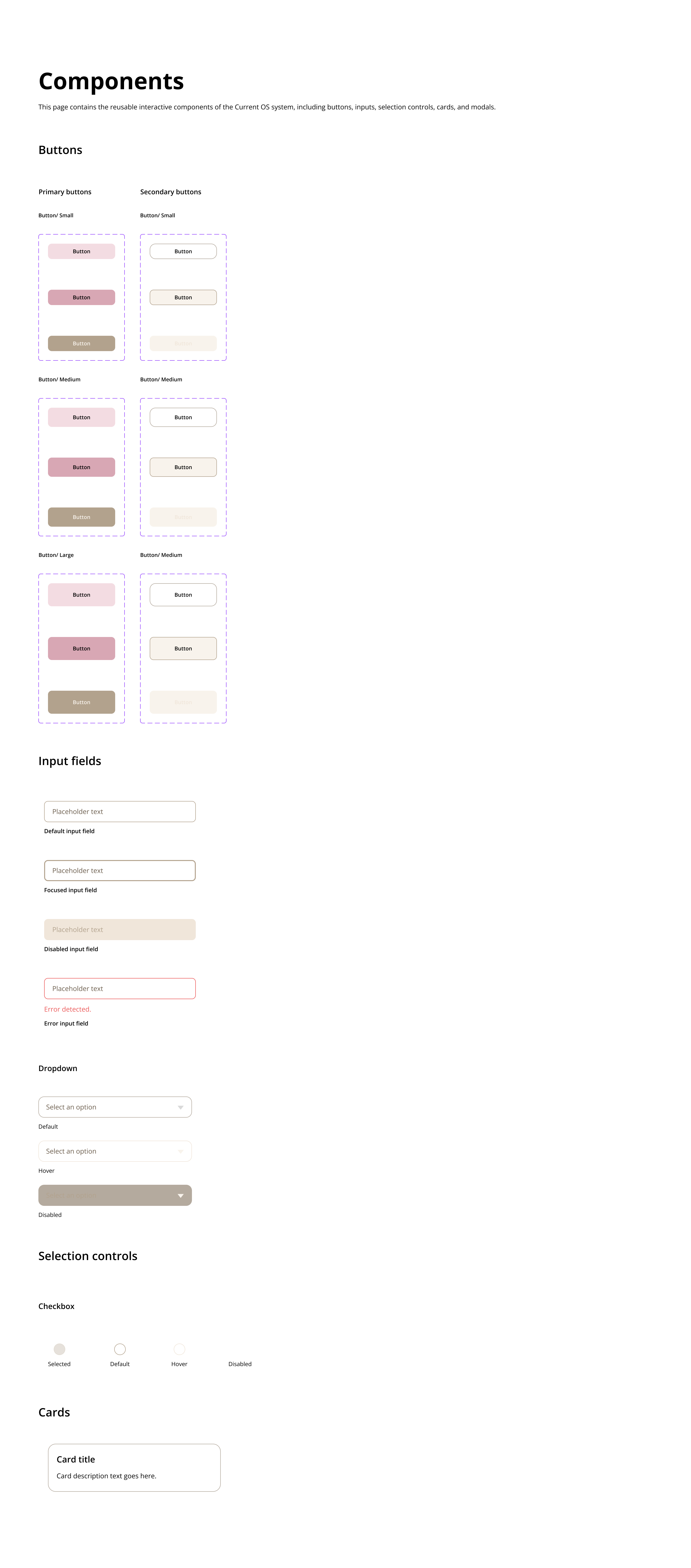
I started out with building a small but meaningful set of components that demonstrate interaction logic and system scalability.
Components include:
Each component follows standard:
All are built as variant sets in Figma for real usability.
This project sharpened my ability to:
It was a great experience that enhanced my understanding and working knowledge of design systems through hands-on practice to align the combination of logic, clarity, hierarchy, and interaction thinking aligns with how I naturally approach product and UX design.